Design Objects
All the design objects mentioned below are present in the installation. Open daily, 12–7pm — free admission.
Pentagonal Lehni Installation
Installation Element
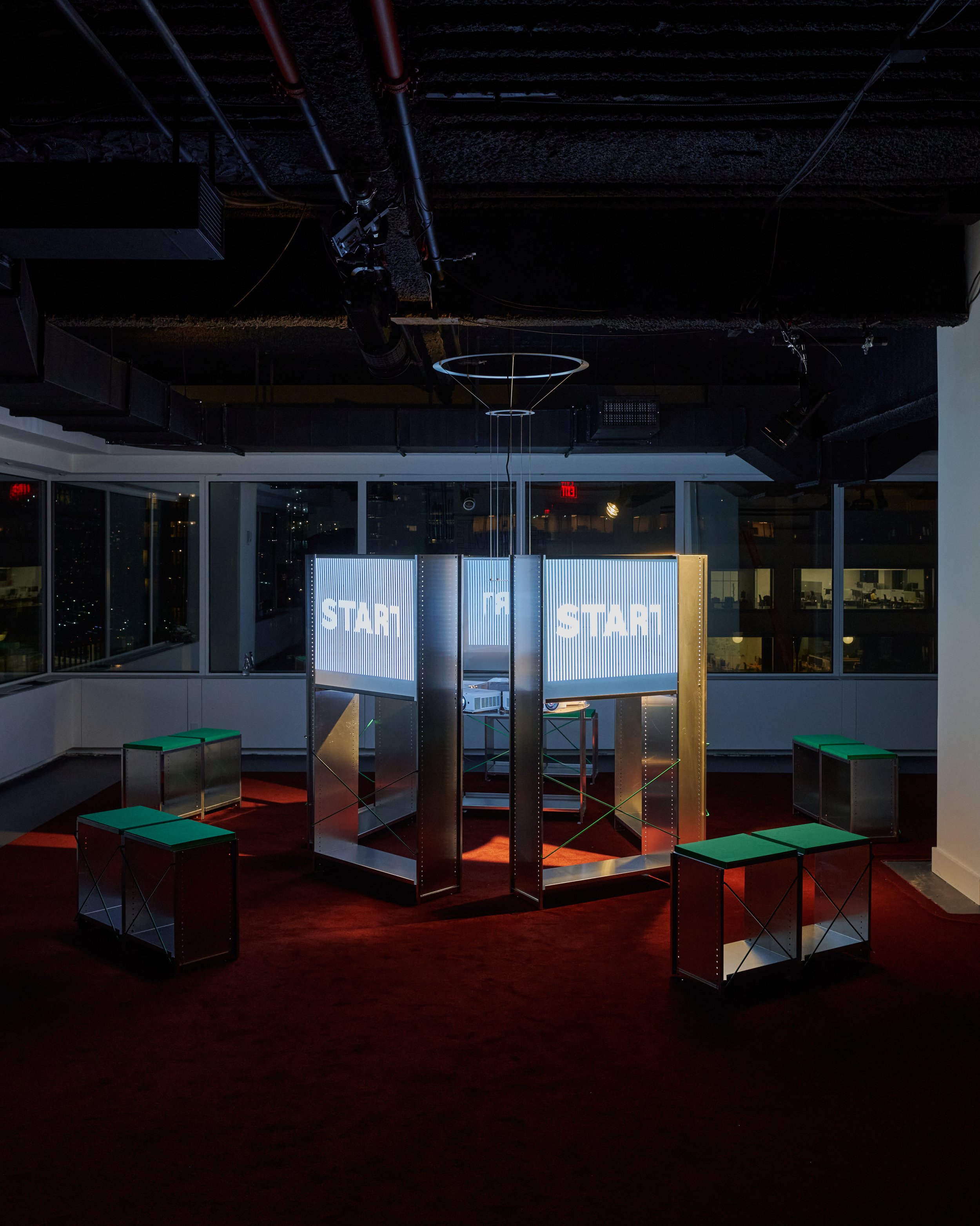
”Aluminum Shelf” (1964) by Andreas Christen, with interventions by Ben Ganz
Designer
Andreas Christen & Ben Ganz
Manufacturer
Lehni, Switzerland
What is specific about the design
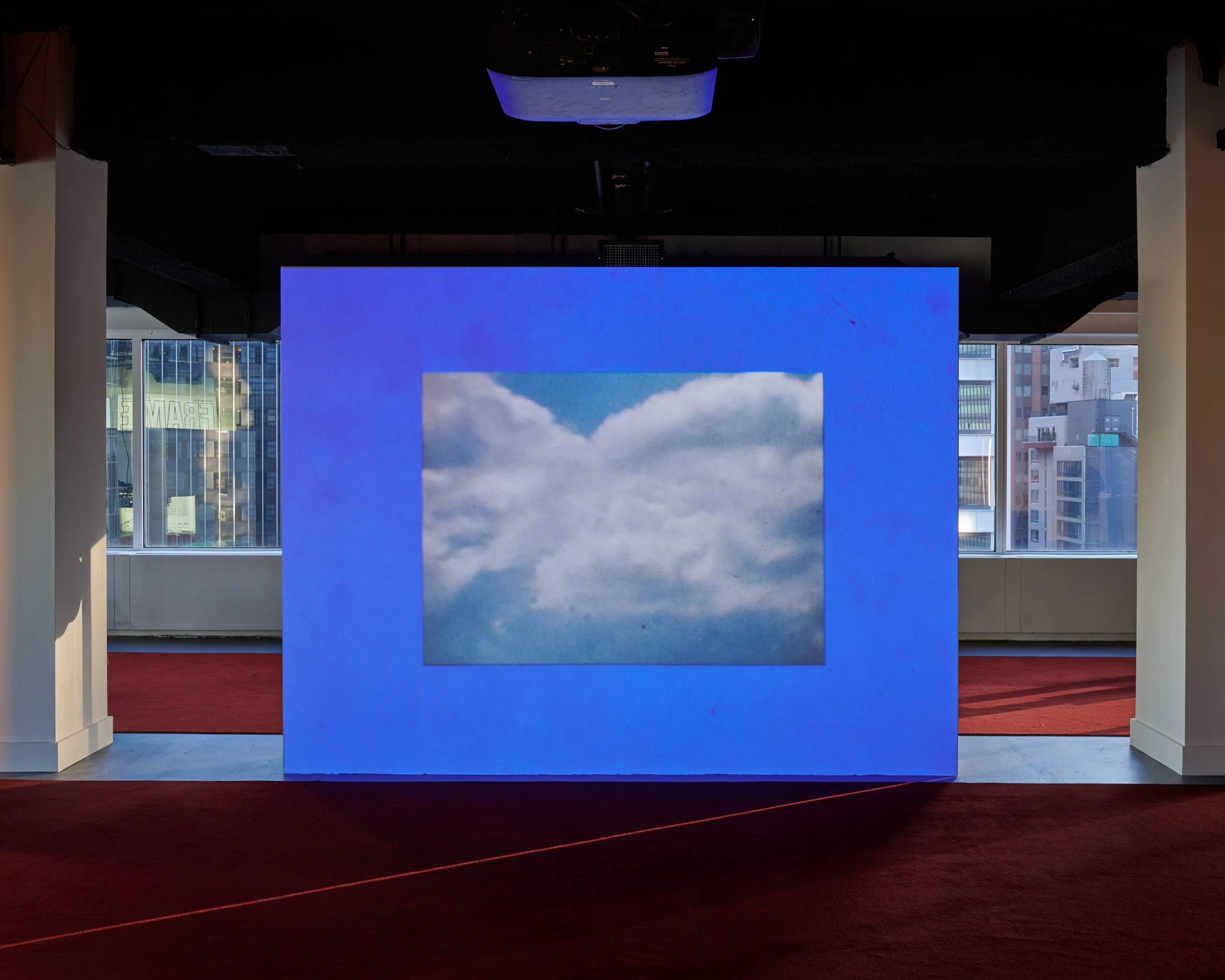
Originally developed by Andreas Christen for the Swiss National Exhibition Expo 64, the “Aluminum Shelf” is constructed from lightweight aluminum profiles assembled into a modular open structure defined by repetition and constructive precision. In Frame in Frame, Ben Ganz reconfigures the shelving system into a pentagonal projection architecture without altering its underlying logic. Projection film stretched within the shelf openings becomes a surface for early works from the Basel “Film + Design” archive, produced during the same years as the shelving system itself. Like the furniture, these films are shaped by structural organization and visual clarity rooted in the Swiss graphic tradition while simultaneously developing a surprisingly playful and experimental visual language. Subtle interventions, including green powder-coated cross-braces, draw attention to the system’s constructive details. Works from «Permutations», a workshop initiated by Jonas Vögeli at ZHdK and developed together with Ganz, are also screened in rotation.
Why it is included in the exhibition
The installation makes visible the unexpected relationship between Swiss modernist furniture systems and experimental moving image culture emerging during the same period. While the shelving system represents the precision and reduction commonly associated with Swiss design, the films projected within it reveal how similar structural principles could generate radically different visual expressions. The work therefore functions as a central spatial and conceptual framework for the exhibition.
About the designer (Ben Ganz)
Ben Ganz is a contemporary Swiss designer based in New York, working across art direction, editorial design, branding, and product design. His interdisciplinary practice bridges Swiss design traditions with a more experimental, graphic, and cultural approach. In this exhibition, his interventions introduce a contemporary layer to Christen’s system, recontextualizing it within a visual and spatial language that connects design, media, and exhibition-making.
Stripes Rug
Installation Element
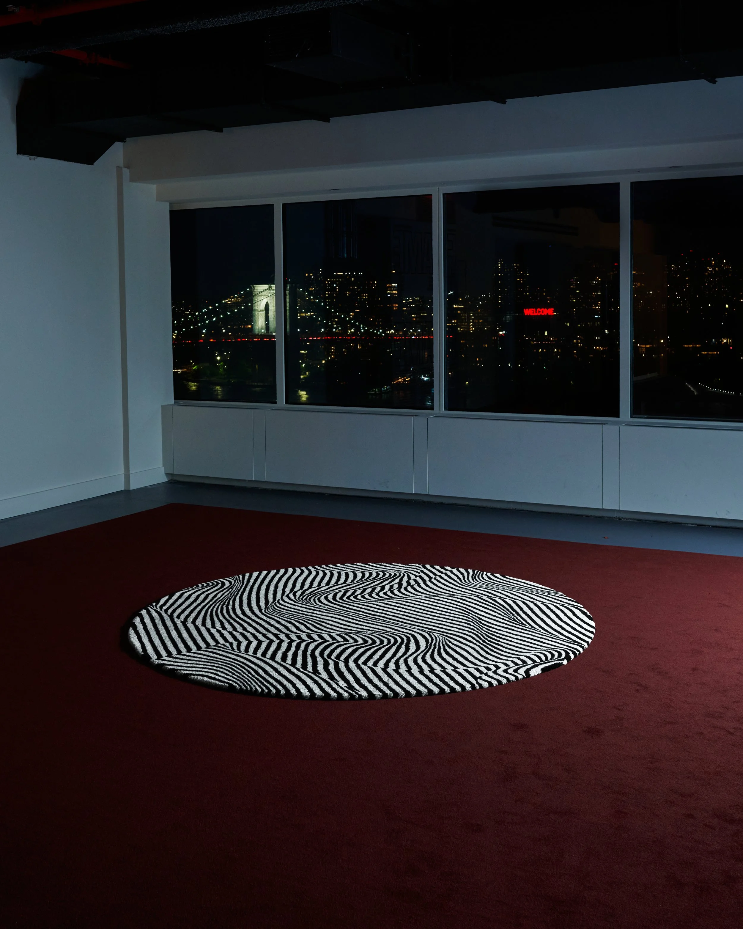
“Stripes” rug (1988) by Trix & Robert Haussmann (updated version produced in collaboration with Edition H)
Designer
Trix Haussmann & Robert Haussmann
Manufacturer
Ruckstuhl, Switzerland
What is specific about the design
Originally designed in 1988 by Trix and Robert Haussmann and recently reissued by Ruckstuhl in collaboration with Edition H, “Stripes” translates a photograph by Alfred Hablützel of a folded silk scarf into a tufted carpet whose striped pattern appears to bend and shift spatially through folds and shadows. Rather than functioning as a stable geometric grid, the lines create optical instability and the illusion of movement across the surface. The rug therefore introduces visual tension into the ordered language commonly associated with Swiss modernism. The new edition is produced in Langenthal using robot tufting and incorporates a yarn made of more than 60% recycled wool sourced from discarded clothing. Each rug also includes a digital product identity developed with World of Pi, documenting materials, production, and lifecycle data.
Why it is included in the exhibition
Within the exhibition, “Stripes” mediates between the rational structure of the Lehni installation and the projected films. While many visitors associate Swiss design with clarity or modular order, the Haussmanns reveal another dimension of this tradition shaped by visual instability and spatial disorientation. The rug prepares the transition toward the films, many of which similarly expand the visual language of the Swiss Style into rhythmic and perceptually complex forms.
About the designers
Trix and Robert Haussmann were central figures in postmodern design discourse. Through furniture, interiors, exhibitions, and theoretical writings, they questioned the rigid functionalism and claims of stylistic purity associated with modernism. Their work frequently combined historical references, irony, and spatial illusion, developing a design language that challenged conventional distinctions between function, decoration, and narrative.
Modular Cinema Seating - “Anagram” Sofas
Installation Element
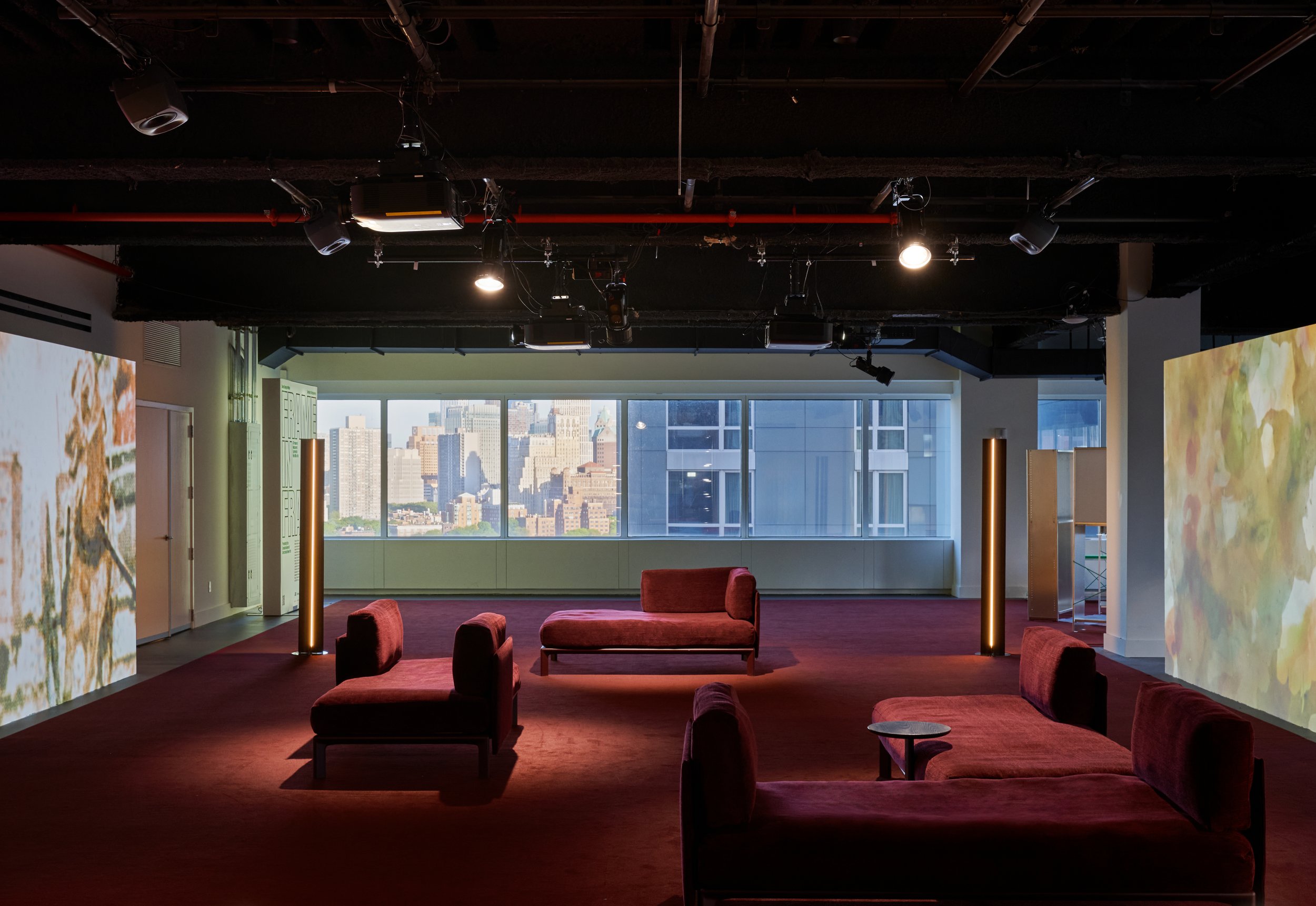
“Anagram” Sofa System (2024) by Panter&Tourron, upholstered in a soft flat-woven chenille fabric
Designer
Panter&Tourron
Manufacturer
Vitra, Switzerland
What is specific about the design
“Anagram” is a modular seating system developed in response to shared and constantly changing living and working environments. Based on a click-in mechanism, its elements can be reconfigured within minutes without tools, allowing the system to shift between different forms of collective and individual use. Rather than defining a fixed seating arrangement, the sofa functions as an open platform that can continuously adapt over time. Upholstered in Iroko 2, color 14 Bordeaux, “Anagram” combines tactile softness with a highly structured underlying system. Like many classical examples of Swiss design, it is based on modular organization and grid-based structures while translating these principles into a contemporary seating landscape shaped by flexibility and long-term use.
Why it is included in the exhibition
Within Frame in Frame, “Anagram” forms a flexible cinematic landscape for viewing the films and can spontaneously be rearranged into rows for talks and discussions. Its changing configuration re-flects the exhibition’s interest in structures that remain open rather than fixed, responding to shifting forms of collective use and social interaction.
About the designers (Panter&Tourron)
Panter&Tourron, founded by Stefano Panterotto and Alexis Tourron, is a Lausanne-based studio working at the intersection of design, technology, and culture. Their practice focuses on developing adaptable systems and spatial concepts that respond to contemporary modes of use. In this exhibition, they contribute a flexible seating landscape that responds to shifting modes of use, supporting both film viewing and public talks.
USM Haller Bar
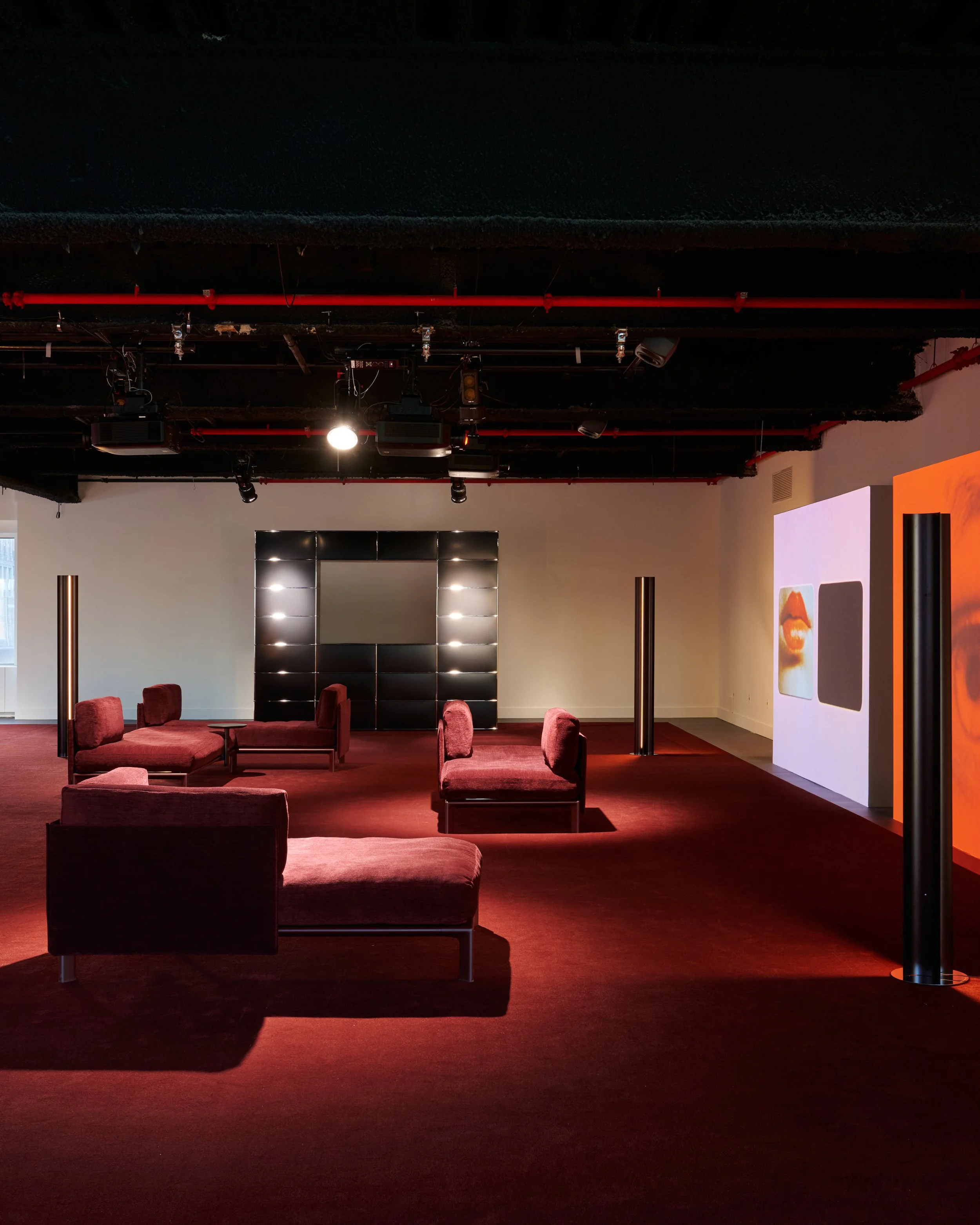
Installation Element
“USM Haller” modular furniture system (1965), configured by Panter&Tourron as a bar element
Designer
Fritz Haller & Paul Schärer
Manufacturer
USM Modular Furniture, Switzerland
What is specific about the design
The “USM Haller” system is constructed from a small number of standardized components: chrome-plated steel tubes, spherical connector nodes, and powder-coated metal panels. Based on this modular principle, elements can be expanded, reduced, or reorganized over time without altering the overall system. Its visible structure, strict proportional logic, and industrial materials reflect the constructive clarity associated with Swiss design of the postwar period. Presented here in Graphite Black, the system emphasizes precision and grid-based order. Developed during the same years as many of the films shown in the exhibition, “USM Haller” translates structural thinking into furniture design through a vocabulary of repetition and variation. Included in the collection of the Museum of Modern Art in New York, it remains one of the most influential modular furniture systems of the 20th century.
Why it is included in the exhibition
Reconfigured by Panter&Tourron as a bar element, “USM Haller” functions as a spatial grid and focal point within the exhibition. Many visitors associate Swiss design primarily with rational systems, neutrality, or typefaces such as Helvetica. The films shown in “Frame in Frame”, however, reveal how the same principles could also generate unexpectedly experimental moving images. The system therefore acts as a point of departure for the exhibition’s broader exploration of structure, and visual perception.
About the designers (Haller & Schärer)
Fritz Haller was a Swiss architect known for developing modular systems in both architecture and furniture. Together with engineer Paul Schärer, he created the “USM Haller” system, which remains one of the most influential modular furniture systems of the 20th century.
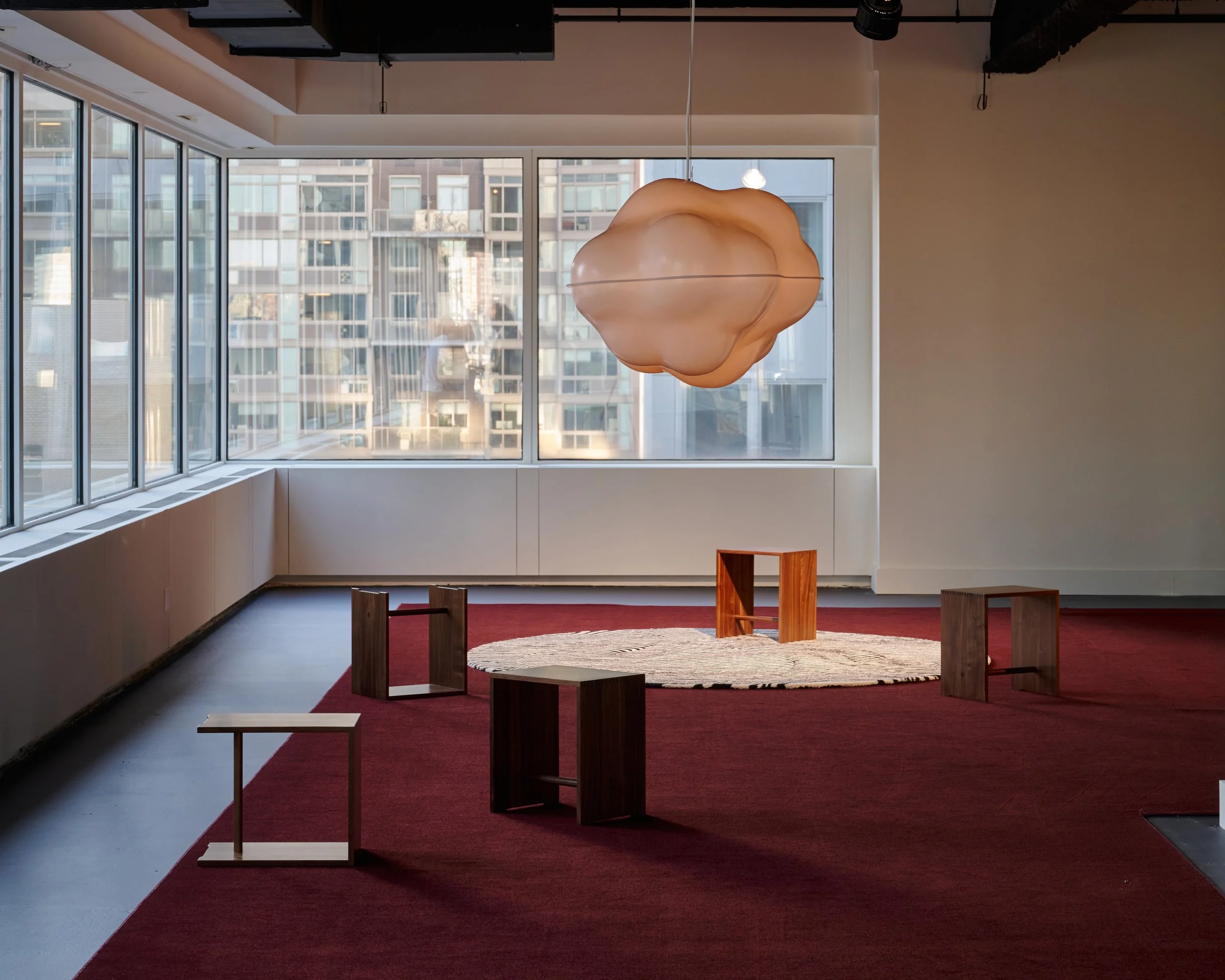
Ulm Stools
Installation Element
“Ulmer Hocker” (1954)
Designers
Max Bill, Hans Gugelot, Paul Hildinger
Manufacturer
wb form, Switzerland
What is specific about the design
Originally developed for the Hochschule für Gestaltung Ulm, the “Ulmer Hocker” is constructed from a small number of precisely joined wooden elements in which form emerges directly from construction. Made from beech and spruce wood, the stool can function as seating, a side table, a shelving element, or a carrying tool. A circular hand opening in the central board allows it to be easily moved through space while simultaneously stabilizing the structure. Its visible joinery and reduced geometry reflect the pedagogical approach of the Ulm School, where design was understood as a precise relationship between construction and use rather than as formal styling.
Why it is included in the exhibition
Within the exhibition, the stools function as seating for talks while remaining easily movable throughout the space. Their ability to shift between different uses reflects the exhibition’s broader interest in adaptable systems and non-fixed forms of interaction. The object also connects Swiss design culture to the Hochschule für Gestaltung Ulm, whose educational ideas strongly influenced postwar visual culture internationally.
About the designers
Max Bill was a central figure of Swiss modernism working across architecture, art, typography, and industrial design. Together with Hans Gugelot and Paul Hildinger, he developed the “Ulmer Hocker” within the pedagogical context of the Hochschule für Gestaltung Ulm, one of the most influential design schools of the postwar period.
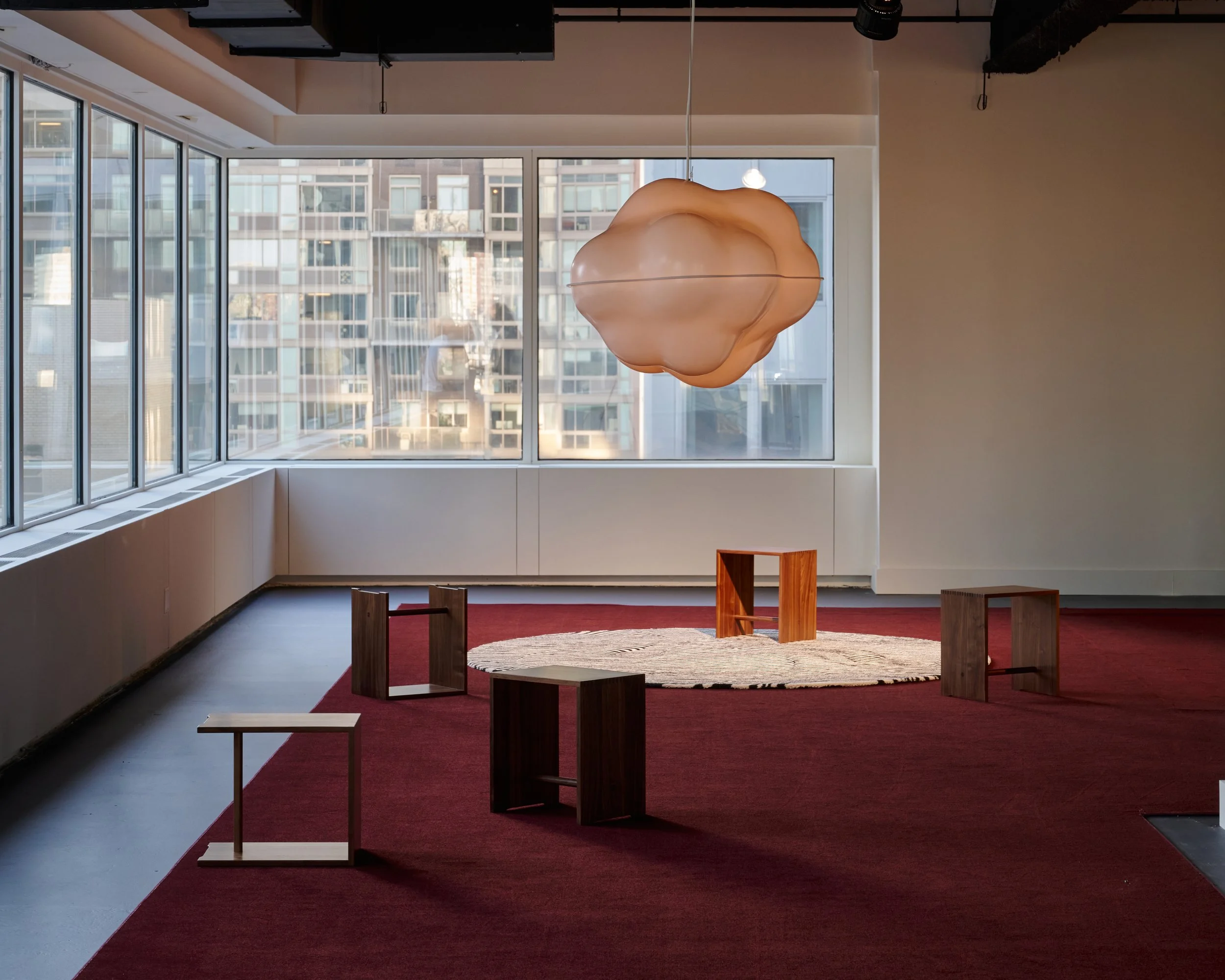
Cloud Lamp
Installation Element
“Wolkenlampe” (1970)
Designer
Susi Berger & Ueli Berger
Manufacturer
Wohnbedarf, Switzerland
What is specific about the design
The “Wolkenlampe” consists of translucent thermoformed plastic elements assembled into an irregular cloud-like volume that diffuses light softly throughout the surrounding space. Rather than directing light through a clearly defined geometry, the lamp creates an atmospheric presence whose contours appear to dissolve visually. Developed at a moment when Swiss design was often associated internationally with rational systems and formal restraint, the object introduced softness, ambiguity, and a nearly immaterial spatial effect into this context. Its amorphous form stands in strong contrast to the rigid geometries commonly linked to Swiss modernism.
Why it is included in the exhibition
Like the Haussmanns’ “Stripes” rug, the “Wolkenlampe” marks a transition away from strict functional reduction toward a more perceptual and atmospheric understanding of design. Within the exhibition, it resonates with many of the films on view, which similarly expand the visual language of the Swiss Style into light, movement, and spatial ambiguity.
About the designers
Susi Berger and Ueli Berger were Swiss designers working across furniture, lighting, interiors, and art. Emerging in the late 1960s and 1970s, their work moved beyond strict functionalism toward more experimental and atmospheric forms of design. They became known for their use of industrial materials and for creating objects that blur the boundaries between sculpture, environment, and utility.
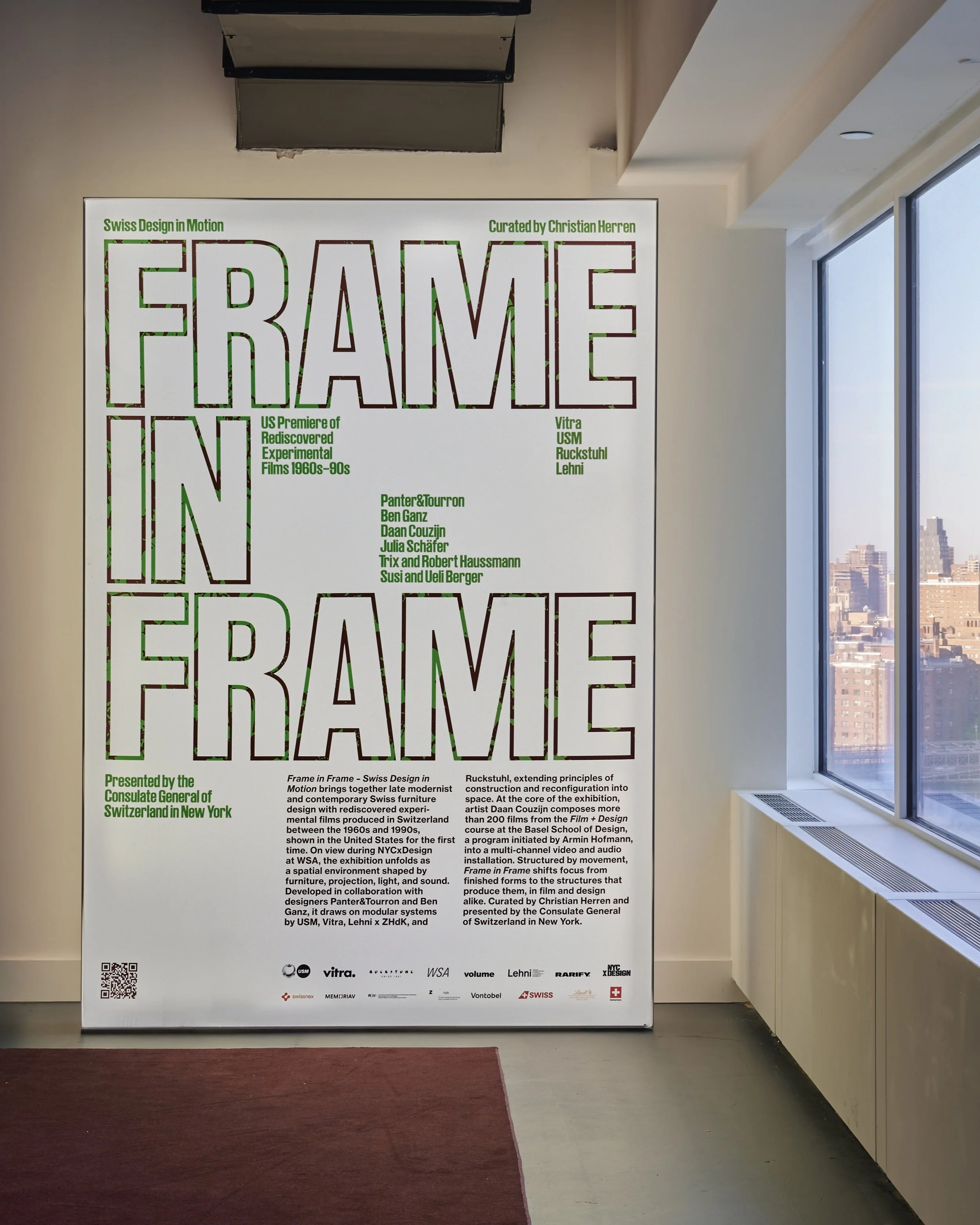
artistic direction Visual Identity exhibition
Installation Element
Artistic Direction and graphic design of printed matter, accompanying digital assets, title plates for the films, and exhibition wall
Designer
Julia Schäfer
What is specific about the design
For Frame in Frame, Julia Schäfer of Volume created the exhibition’s visual identity by drawing on the formal language of Swiss Style typography together with the visual logic of the structural films presented in the exhibition. Overscaled condensed type, fragmented compositions, and shifting typographic hierarchies translate cinematic strategies such as sequencing, repetition, cropping, and duration into graphic form. Distressed textures and high-contrast color fields introduce material instability into otherwise rigid grid structures, creating a visual system that moves between precision and disruption. Across print, animation, and spatial applications, the identity extends the temporal and perceptual qualities of the films into the exhibition environment itself..
Why it is included in the exhibition
The visual identity functions as an integral part of the exhibition architecture, connecting films, objects, and spatial experience into a cohesive visual system. By referencing both the historical legacy of Swiss graphic design and the experimental formal strategies of structural film, the work reflects the exhibition’s broader interest in perception, temporality, movement, and the relationship between image and space.
About the designer
Originally from Basel and now based in Brooklyn, Julia Schäfer explores how digital technologies reshape the body through a design-driven artistic practice. Alongside her work at MoMA PS1, she has collaborated with Aperture, Morcos Key, Food, and 101 Coding and Design. She is also part of Volume, a studio led by Lau Huaranga, Furqan Jawed, and Julia Schäfer working across visual identities, exhibitions, publications, websites, campaigns, and type design. She frequently teaches and participates as a guest critic at institutions including School of Visual Arts, Parsons School of Design, Pratt Institute, Yale University, and Zurich University of the Arts.